Thursday 15 July 2010

JLS Digipak


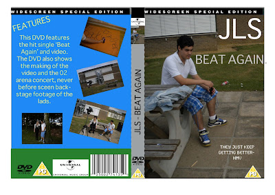
The first picture is our poster which advertises our dvd and single. The text is similar theme on both the dvd and poster to keep similar style and help attract the audience.

Friday 9 July 2010

DVD Cover analysis


This is the DVD cover for Missy Elliot and Busta Rhymes in Super Human . The title is eye catching and links with the colour scheme of red and yellow. The 2 artists are positioned in the centre of the image to show their significance. In smaller print the features of the dvd and title tracks are on the bottom of the image.

On The back of the DVD cover the Title is repeated in the same colour as the front but in smaller text. Down the left hand side is 4 still images of individual tracks on the dvd. There is a small blurb describing what is included on the DVD and talks about the different tracks. Below that is a list of tracks included on the DVD and who they are by. In smaller print there is small statement backing up the director. Also included at the bottom is a list of directors and producers and everybody included in the making of the songs. In the big white box you have a neccesary information such as running time, the date that the dvd was made, the certification ratings, special features headings, copyright information, a barcode, company logo and certification logo.

Spine:
It has a small thumbnail of the front cover picture on the spine. It also has the title on the spine in the same yellow like the one on the front cover. It has the company logo and catalogue number.

On the disc:
It has the same information as it does on the spine, but in a more simple font & black and white.

DVD Cover analysis

Thursday 8 July 2010

DVD cover and magazine ad

DVD Cover:
possible ideas- Boyband, Location= field?
look at other boyband album covers e.g Take That, Boyzone, Westlife
links to video
idea 1- Beat Again on orange sheet?

Magazine Ad:
Boyband together posing?..
link to DVD cover and video
Heart theme to link with Beat Again..

Feedback Analysis

We agreed with the fact that more boys were needed in the video to match a boyband image. We also think that there needs to be more close ups to show off lip syncing. This was hard because we only had 1 boy in the group as Adam did not turn up and we didnt have long to prepare. We think that more close ups were needed in each location. This would help with Voyeurism and help sell the artist more and overall would look like a better music video. We are pleased that the Sheets with lyrics on worked well and some groups were impressed.

U2-57

Genre-Characteristics:
Met the conventions by using a love scene which matched the lyrics of the song, however a dance routine would've been more conventional.
Selling the artist:
The main artist is too far away to see the lip synching, therefore the artist is not sold very well at all as there are no close-ups or mid-shots.
The story involved would've been interesting if we could see the whole video but sadly we could not, so the voyeurism is good for what was available.
U2 58
It was good how the video had a story where the singer was after the girl. This could also be voyeurism. It was good how the singer lip synced and had the microphone. The artist was sold in this video because he was the main focus. The boards where a good idea and worked very well as they used the visuals/lyrics conventions. There was more than one location in the video which is a typical convention of the pop boyband genre.
To do it differently we would have more than one singer and add some dancing and girls.
cool
 
© 2009 12U2-56 - Intro To Music Video 10'. All Rights Reserved | Powered by Blogger
Design by psdvibe | Bloggerized By LawnyDesignz